Jaguar’s 2024 rebrand was nothing short of radical. The luxury automaker scrapped its iconic leaping-cat emblem, embracing what it dubbed “exuberant modernism” — think neon visuals, abstract fashion shoots, and slogans like Copy Nothing and Live Vivid, with no cars in sight. It was a deliberate attempt to break from tradition and target a younger, more socially progressive crowd ahead of its all-electric relaunch.
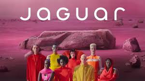
But the backlash was swift and fierce. Industry experts warned that abandoning core heritage would alienate loyal buyers, and public figures didn’t hold back: Elon Musk sarcastically asked, “Do you sell cars?” on X, and critics blasted it as “woke” fluff. Notably, Roger Martin, a marketing scholar, cautioned that the campaign’s lofty messaging disconnected from the real reasons customers choose Jaguar—performance and prestige.
Then came the hard data: European sales in April 2025 plunged 97.5%, with just 49 registrations versus 1,961 a year earlier, and year-to-date figures were down over 75%. While Jaguar attributes some of this to intentionally halting internal-combustion model production ahead of its EV line-up, dealerships were left empty, brand equity was drained, and the core audience felt overlooked. It’s a stark lesson: stripping away history without giving customers something real in return can cost more than a logo—it can cost survival.
Range Rover’s Safe Logo Shift: A Lesson in Playing It Too Safe
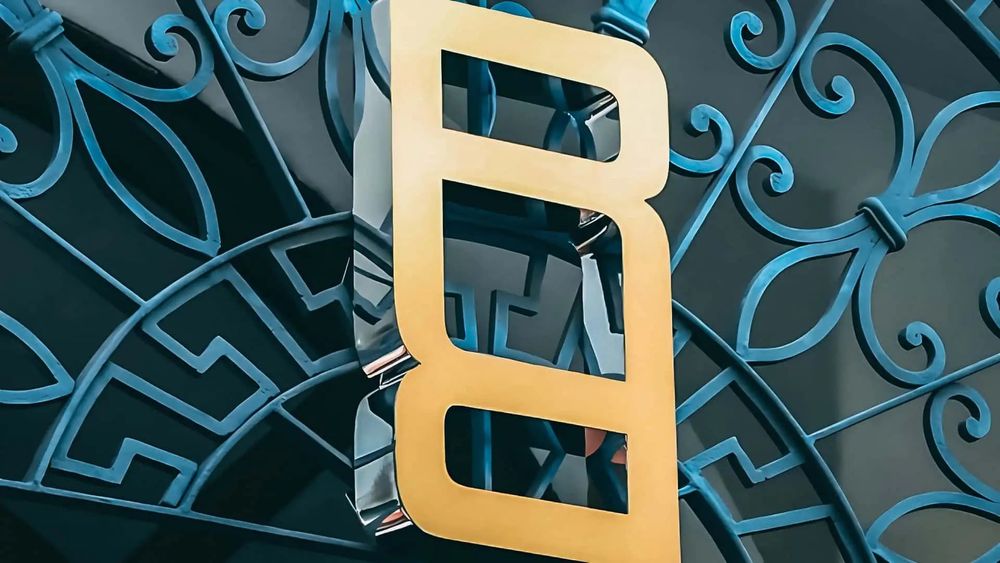
Range Rover’s latest branding move feels suspiciously cautious: they introduced a stacked, mirrored “RR” emblem—meant for labels, event spaces, and accessories—not a full vehicle badge. This muted reveal coincided with their “House of Brands” shift, positioning Range Rover alongside Defender and Discovery with its own visual identity—but with zero change to the iconic hood script.
Despite JLR presenting it as a tasteful refinement, critics pounced. Motor1 slammed it as “goofy as hell”, while Creative Bloq called it a potential “branding disaster of the year,” questioning whether it feels right for a car brand. One commenter even said it looked like a “belt buckle” or “something a dance artist from the early nineties would use for their debut album cover”.
On Reddit, opinions clash. A r/Cars user acknowledged its potential:
“Used in a pattern it looks pretty neat” one user said.
But across social channels, more dismissive voices prevail, with comparisons to fast-fashion or designer knock‑offs, not a luxury SUV icon. Bottom line: it’s a safe pivot that escaped the controversy of a full rebrand—but it also risks blending into the noise, looking less like luxury and more like filler.
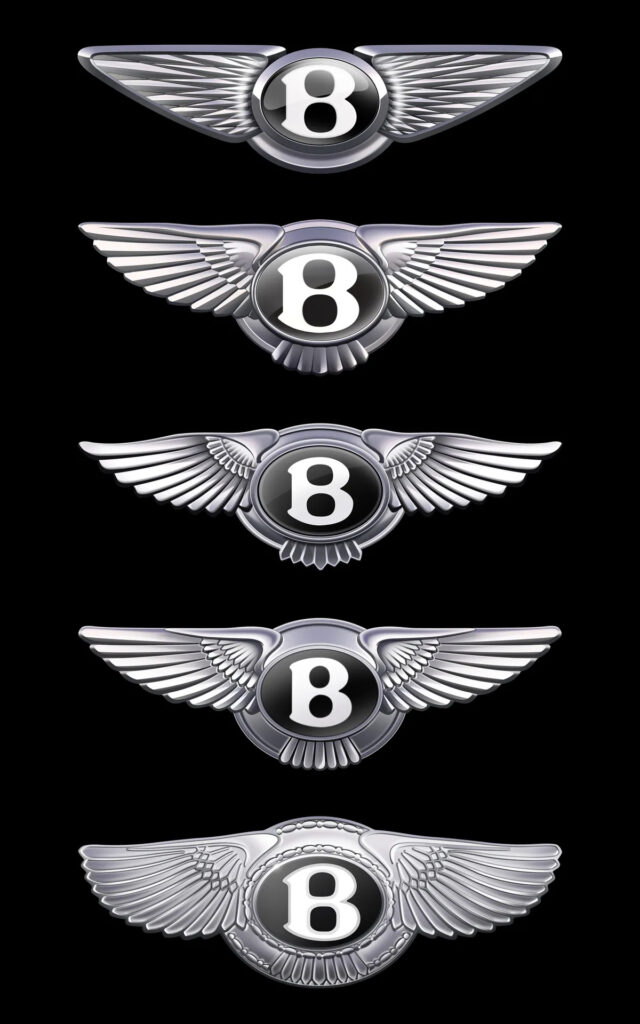
Bentley’s Elegant Rebrand: How Heritage and In-House Design Won Big
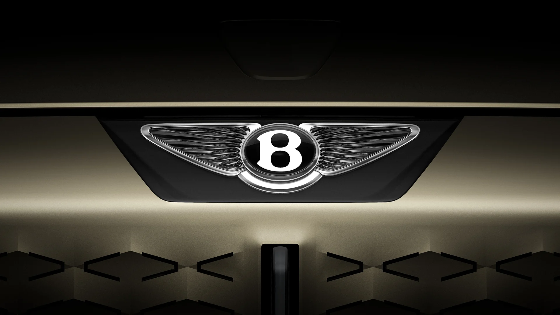
Bentley has just unveiled a refreshed version of its iconic “Winged B” logo — only the fifth evolution in its 106‑year history — thoughtfully crafted entirely in‑house under the guidance of Director of Design Robin Page. The evolution isn’t radical; wings are now sharper, more angular (inspired by peregrine falcons), and the lower feathers have been stripped away for a cleaner aesthetic. Even the central “B” has been retooled with a bevelled, 3 D jewel-like finish—meant to stand alone as a graphic asset in digital and on-grey backgrounds.
Execution was just as elegant. Bentley ran an internal design competition, with concept work submitted by its entire creative team. The winning idea came from Young Nam, a junior in the interior design department, who proposed the sharper-edged wings that became the final design. This refined mark made its first public appearance on July 8, adorning a forward-looking concept car and coinciding with the grand opening of Bentley’s brand-new, multi-story Design Studio at its Crewe headquarters—signifying a holistic branding roll‑out, not just a one-off logo change.
The response has been overwhelmingly positive. DesignRush praised Bentley for “refining rather than replacing” its heritage — pinpointing how the updated badge maintains digital readiness while retaining luxury and depth. Creative Bloq called it “perfect,” noting it avoids the trap of erasing history, unlike competitors. Importantly, this logo isn’t launching into a vacuum: it was simultaneously backed by the tangible force of a concept car and a fully refreshed design language—a strategic, story-driven branding that keeps both legacy and future firmly in view.
What SMBs Can Learn (and Test) from These Brand Moves—With AI Tools
In today’s hyper‑saturated attention economy—where it’s easier than ever to crank out “okay” creative with templated AI tools—SMBs must choose a higher bar. When everything looks the same, standing out means going above and beyond. Brands that lean into authentic storytelling, thoughtful design, and elevated craftsmanship don’t just blend in—they command attention. That’s where small businesses win, not just by being different, but by being meaningful.
But standing out doesn’t require huge budgets—it demands smart application of resources, and that’s where AI becomes a strategic ally. Recent data shows 77% of SMB marketers using AI feel more confident in their creative work, and 75% believe it helps them compete with larger firms by enhancing quality and efficiency. From mood‑board generation to A/B visual testing, AI offers a fast, cost‑effective test lab. Yet, its true value lies not just in execution, but in amplifying your brand’s genuine story. As one Forbes piece noted, early AI adopters used it as a marketing lever to differentiate, not replace, their voice.
So here’s the SMB playbook: let AI handle ideation, iteration, and analytics. Then invest your energy in layering on authenticity—a handcrafted narrative, heritage-rooted visuals, community‑led feedback, incremental edits. In a world where AI fatigue is real and content sameness rampant, brands that are meaningfully refined, not generically polished, stand out in a crowd. The brands that go the extra mile—story in focus, not just style—are the ones that build lasting loyalty and real competitive advantage.
